Welcoming and Clever Home Entrances: 10 examples
By Editorial Team
Updated on October 4, 2024
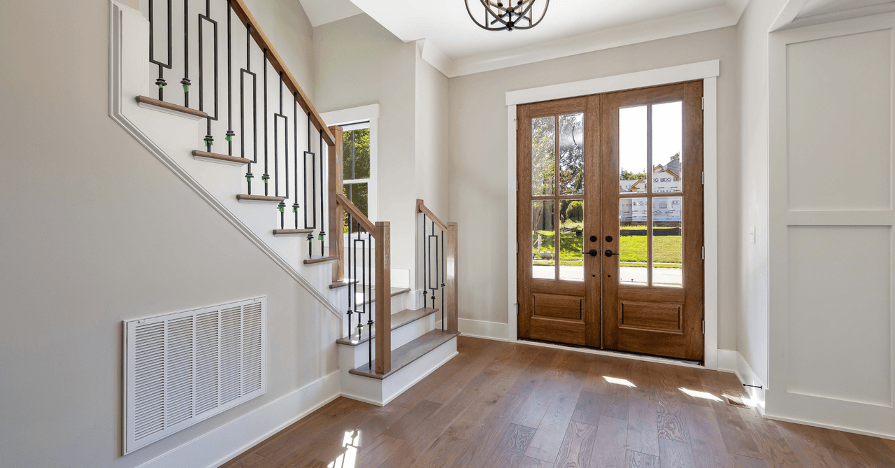
The entrance of a home is a space often neglected when considering the overall layout. We don’t spend so much time in this space, as we commonly pass through it quickly when coming or going. Of course, we underestimate the extent to which the layout of our entrance can have a considerable impact on our quality of life.
First, it’s important to integrate a good storage system into this space. The Canadian climate requires a change of clothes according to the seasons and in winter, your home entrance should be able to accommodate boots, big coats and other accessories with easy access.
Then, we can consider the decor. The entrance is the space that welcomes us when we arrive at the end of the day and it’s also the last room we see when we leave. Why not make it a beautiful space?
By reading the rest of our article, you’ll discover 10 examples of entryways with interesting decor and accessories.
10 examples of beautiful and well-organized home entrances!
1- An entrance bounded by a sliding barn door
Source: Canva
Some entrances are separated from the rest of the house with a door, while others are left fully open. These two options each have advantages and disadvantages, so here’s an interesting alternative: the barn door. This type of door allows the partition to be opened or closed according to your preferences and needs.
For example, during winter, it may be best to keep the barn door closed to reduce the circulation of cold air indoors. In summer, when you want to make the most of daylight, you can simply slide the door open so that the light from the window enters the interior.
We also find this entryway to be particularly interesting when it comes to storage, with a shelf that doubles as a bench where folks can sit when they need to put on boots or shoes. Individual lockers make it easy for each member of the family to find their accessories.
2- A country-style entrance with modern touches
Source: Canva
This entrance is simply decorated and furnished. There is some overhead storage, which allows for a seasonal rotation of shoes and accessories.
The tile floor is easy to take care of, which is a great feature for an entryway, as dirt and things that stick to our shoes are dragged with us when we are outside. This is all the more important in Canada, with the heavy snowfalls that we get during our long winters!
3- A nice storage unit for a simple and charming entrance

Source: Canva
The decor style of this lobby could fit very well in a beach house. Minimalist, bright and full of light, this arrangement has a soothing effect simply by looking at it.
Of course, this entrance doesn’t contain much storage. Thus, for the daily needs of a family, it isn't a very efficient layout. However, for a couple or a single person, this small piece of furniture and its storage bins should suffice.
4- A foyer with a cleaning station for pets
Source: Canva
Here’s a setup that dog owners may like to have in their homes. Indeed, this entryway includes a shower for pets!
Those who have dogs know how good they are at attracting dirt. To prevent all the mud, grass, small rocks, dust and other items that stick to their fur from spreading around the house, a cleaning station can be installed in the entrance.
Also, we like this entryway because of the large amount of storage space. Finally, the combination of black, white and wood is timeless, which means that the decor won’t go out of style anytime soon.
5- An entrance with very trendy decor
This entryway layout is similar to the one we presented in number 3. There is relatively little storage space, but what is there is very effective.
The room caught our attention because of the arch that divides the entrance hall from the rest of the house. Finally, we noticed the patterned tile floor that adds a touch of life to the decor which is otherwise minimalist and neutral. This creates a relaxing space, perfect for a smooth start to the day.
6- A hallway-shaped entrance that maximizes the available storage

Source: Canva
Many home entrances lack a place to rest when putting on boots, jackets and snow pants. If there’s enough space available, it would be interesting to incorporate a comfortable bench among your additional storage and furniture.
In this entrance hall, the bench is well integrated between two wardrobes. Also, there’s very little wasted space, as we see high shelves as well as drawers below the bench. We’d say this space is very comfortable and welcoming.
7- A bold pattern for an easy-to-maintain entrance floor

Source: Canva
This entryway’s storage unit is more of a minimalist take than the one shown in our previous example, but it would still suit the needs of certain homes. If the entrance comes equipped with a wardrobe, the hooks can be used to hang coats that are often worn, while other clothes can be stored out of sight.
The decor of this entrance is unique and colourful, incorporating soft tones. The tile floor pattern adds a certain dynamism that offers a nice visual harmony.
8- An entryway that serves as a laundry room

Source: Canva
Why not create a multi-functioning entryway? The closet is used to store clothes, the bench is there to taking a moment when getting ready, and the rest of the space serves as a laundry room.
Here, we have a white and bright entrance/laundry room that is not overtly neutral. There are small touches of rustic decor, a white wall covering and a wooden floor, as well as the rare decorative elements in rattan or glass that show some signs of ageing.
We particularly like the idea of having all these windows, which allow one to admire the landscape. This would make washing clothes much more pleasant!
9- An entrance designed for a large family
Source: Canva
Storage, storage, storage: this main objective cannot be repeated enough. Here’s an example of a house entrance that is perfectly suited for a large family, with all the clothes, accessories, toys and sports equipment that a home with adults and children can accumulate.
Instead of the classic hues of cabinet doors, the owners opted for a soft and refined blue shade. Honey-coloured accents add warmth to the decor, which creates a nice balance alongside the shades of the decor, namely pale gray, white and of course, blue.
10- A colourful entryway to evoke a bit of good humour
Source: Canva
Lastly, here’s a colourful and unique entryway. Not everyone would be willing to have a firefighter red front door, but we also know a lot of folks (including us) would take on this bold accent.
Red is a lively shade, it offers energy and fits in well with many decor styles. Here, the owners opted for simple decor, but with several cheerful little touches including the carpet with a visible pattern and the small cabinet behind the door.
Once again, we like the idea of having separate boxes for different members of the family, which helps to simplify the organization of the room, plus the baskets which create a beautiful visual harmony, in addition to being very practical.
Get 3 renovation quotes for your home renovation project
RenoQuotes.com can help you get quotes for your home renovation project. By submitting your project, we’ll put you in contact with top-rated contractors. Fill in the form on the homepage (it only takes a few minutes), and you will get estimates from trusted professionals.
Dial 1-844 828-1588 to speak with one of our customer service representatives.
Looking for something else?
Related articles
The latest industry news, interviews, technologies, and resources.

Karine Dutemple
•16 Jun 2026
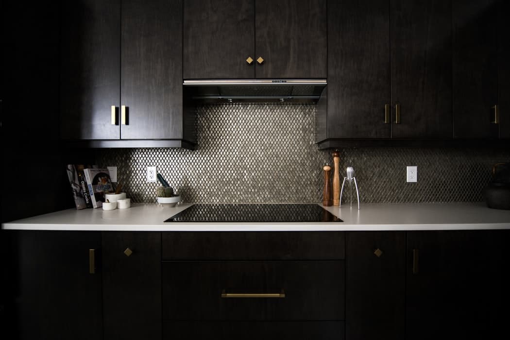
Thinking about adding a new backsplash to your kitchen to revamp your current, outdated design? Here are some ideas to inspire your next kitchen renovation project!
Karine Dutemple
•30 Jan 2025
Whether you choose to place them on walls or floors, tiles are available in a wide variety of colours and sizes. It is because of their great versatility and their ability to enhance the appeal of a room that they occupy such an important place in our homes.

Editorial Team
•05 Sep 2024
Reinforcing your home’s security to prevent burglary attempts is essential. But, where to start? Front doors are often considered key access points. Therefore, we’ll focus on said vital component. Which security systems are the most effective for deterring would-be burglars? This article highlights different ways to protect your home and its occupants. While the options listed don’t exhaust all possible solutions, consulting a professional locksmith will help guide you in the right direction based on your needs and budget.

Editorial Team
•08 Nov 2023
A problem with your water heater is never a good sign, especially since it’s not something that a household can easily go without. Since problems that can arise are numerous and diverse, let's take the time to see how to fix the most common ones. Here’s a summary of the 10 most frequently dealt with water heater problems and the solutions to help fix them.
Editorial Team
•08 Nov 2023
Wall panels are a wonderful feature for the home, and they come in a variety of materials, shapes, styles and colours. Therefore, they can be used alongside almost any home decor, made to suit the needs of any homeowner. Panelling can cover an entire wall, or just half if you so choose. Installing wall panelling is a DIY project that can be easily accomplished with the right steps and the options are endless!