10 Examples of Very Colourful Interior Design
By Editorial Team
Updated on November 8, 2023

Are you the type who prefers a colourful environment to neutral decor that’s focused on shades of gray, beige, and white? There’s nothing wrong with that! Life’s too short to be limited to traditional hues for the walls, cabinets, furniture and floors of your home!
If you like fuschia walls, a yellow bath, green doors and rainbow stairs, go for it! Dare to decorate your home according to your tastes and preferences, no matter how wild they might be. Of course, when it comes time to put your property up for sale, you may have to adopt a more neutral setting to convince buyers. However, while you live there, it’s your needs and those of your loved ones that must be met. So it's time to have fun!
Here are 10 examples of very bold and colourful interior decors!
1- A kitchen with electric blue cabinets

Photo: Andrew Jonathan Design
No more white, black or wood cabinets! Here, they opt for a vivid tone of blue that recalls the works of French sculptor Yves Klein. The artist created sculptures almost always monochromatic with an ultramarine blue called "Klein Blue".
In this kitchen, other elements like the floor and the backsplash are quite neutral, leaving all the more room to showcase the cabinets.
2- A corridor with cyan blue walls

Photo: Apartment Therapy
Our corridors are often neglected spaces because they’re a place of passage that one may not consider as much in terms of decor. Here, there’s no need to think too hard about decorative accessories! It’s the blue of the walls that adds plenty of character to this space. How can one be in a bad mood when we walk from one room to another and before our eyes, we have such a happy colour?
3- A living room in shades of pink and mauve

Photo: Chloé Dominique
It’s rare to see this kind of decor in a "real" house. Rather, we may have the impression of being tucked inside the pages of an interior design magazine! It's mauve on pink on coral on purple, with two other small touches of colour, yellow and light wood.
This decor is quite daring and will not appeal to everyone, but it’s also very sophisticated!
4- A house with white walls with blue accents, like the pretty homes of the Greek Islands

Photo: Gimmy some oven
Do you dream of visiting the Cyclades, this archipelago of Greek islands with landscapes worthy of the most beautiful postcards? One of the commonly recognized elements of this region is the white houses decorated with domes, doors and windows in shades of blue, reminiscent of the sea.
Why not take inspiration from the colours of these houses for your exterior cladding? If this isn’t allowed in your area, you can also consider transposing this colour palette inside the house.
5- A multicoloured living room inspired by the traditions of Mexico

Photo: Living etc.
Mexico is a country known for its very colourful settings. Here, we see a tribute to the great Mexican painter Frida Kahlo, a true cultural and feminist model in her country of origin.
The colour palette is focused on primary colours, complemented by pretty decorative accessories and plants that add a touch more life to this environment.
6- A room like a doll's house
Photo: Lushome
Here, we go straight to the next level with rainbow decor that’s reminiscent of Barbie or Polly Pocket’s home. If you like bright colours, this space will serve you well!
The mauve ceiling, the blue back wall, the purple floor, plus the pink of the armchair- we're amazed!
7- A colourful apartment with a more sober decor
Photo: Projetista de ambientes
Here’s another example of colourful decor, but a little more refined this time. The colour palette is lively, but still well balanced, we adore the variety of patterns and textures. In particular, we notice the brick wall behind the bed, the blue and white wall covering, and the bathroom floor.
8- An exterior painted in blue, pink and yellow
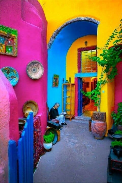
Photo: Shiny Happy World
Who will dare to paint the exterior walls of their house in such vivid colours? In some cities or regions, it’s more common than here, notably in the city of Valparaiso in Chile, around the canals of Venice in Italy and in the "Rainbow Village" of Taichung in Taiwan.
In Canada, it’s rare that we dare to use such bright colours on the facade of a house. However, that doesn’t mean they should be avoided! Be careful to check if you have the right to opt for more vibrant colours, because some neighbourhoods have regulations regarding this, especially in the case of heritage houses.
To learn more about exterior paint, check out this article:
9- An orange and white dining room
Photo: The Kitchn
This dining room seems to be located in a solarium or at the very least, in a very bright room with lots of windows. The owners have opted for a colour scheme focused on tones of orange and white.
Some may say that this decor looks straight out of the 70s, which isn’t wrong! Therefore, for lovers of retro decor, this is a dream space!
Here are other layout ideas for retro decor:
10- A yellow and green dining area

Photo: Yellow Cloud Studio
Colourful decor doesn't need to be adorned! Here’s an example of a minimalist layout, where two tones of colours are put forward: bright yellow and forest green.
These two colours are used to delimit the dining area, which can also be used as a place to hold meetings or work. This creates a beautiful dynamic space, joyful, but all the same rather restful with its refined decor.
Find other examples of minimalist decor:
Get 3 renovation quotes for your home renovation project and to find an interior designer
RenoQuotes.com can help you get quotes for your home renovation project. If you submit your project to us, we’ll put you in contact with the best contractors in our network. Fill in the form on the homepage (it only takes a few minutes), and you will receive quotes from home renovation companies.
Dial 1-844 828-1588 to speak with one of our customer service representatives
Looking for something else?
Related articles
The latest industry news, interviews, technologies, and resources.

Editorial Team
•21 Apr 2026
A mature home often needs that extra bit of TLC to get it back up to speed—especially heading into summer, when warm, dry weather makes it easier to tackle everything from paint and caulking to ventilation and exterior woodwork. The key is planning early so you can keep your home functional without sacrificing its mature charms, like antique fixtures and trimmings.

Editorial Team
•02 Apr 2026
Yet another year has begun, and for a lot of people, the new year is synonymous with a need for change, especially when it comes to home decor. Renovation experts and interior designers observe trends that change from year to year, those that come and go, according to aesthetic preferences and present-day needs.
Editorial Team
•08 Nov 2023
Because of their popularity, hinged, sliding or hung windows rarely need presentation. But what about the fanlight?

Christine Simard
•08 Nov 2023
Are you one of those people who tend to be nostalgic for past eras and not too fond of modern decors? If polka dots, bright colours and geometric forms are all things you like, maybe it's time to give your home a little retro makeover! Here are some examples that could inspire you!

Editorial Team
•02 Aug 2024
The kitchen is a space of collaboration and cohabitation, where friends and family gather to cook, clean and hang out. Many important elements and fixtures occupy this room, and often overlooked is the humble backsplash.