10 Original Paint Colour Ideas for Your Living Room
By Christine Simard
Updated on November 8, 2023
Choosing a paint colour can sometimes turn out to be demanding and complicated. Whatever the brand, there are thousands of shades from which you can choose. Because of this, it is easy to get lost during this process.
Your living room is a space that represents life, movement and gatherings, but also relaxation, comfort and rest. This is why wanting to find the perfect paint colour that reflects all these aspects is perfectly normal. Here are some examples that will help you make the right choice.
10 Original Living Room Paint Colour Ideas
1. Sage
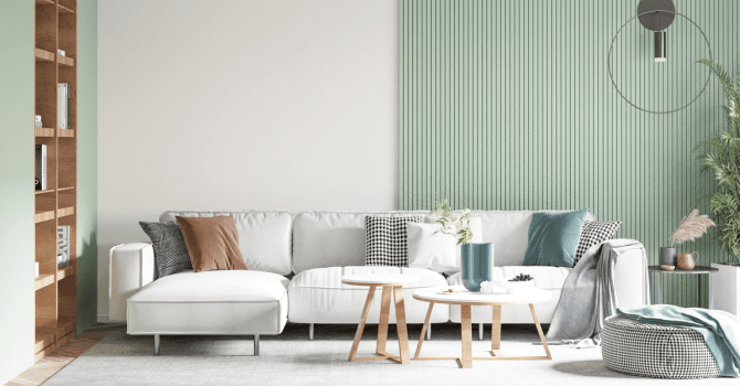
Source : Canva
A colour like this one gives an organic and fresh vibe to your room, which is perfect to give it a bright feel. This colour pairs well with shades of pale blue, dark yellow or white.
2. Dusty pink
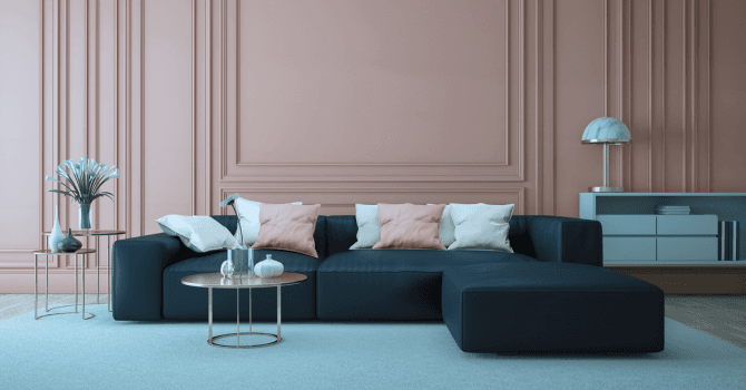
Source : Canva
This shade of pink is not only elegant, but it stands out well when accompanied by a second colour like, white. Combining these two offers a perfect contrast.
3. Periwinkle
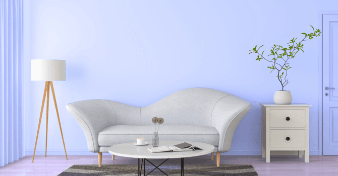
Source : Canva
Periwinkle is a shade between purple and blue. Being a vibrant colour, this tint will have an impact on your room's decor. For lovers of contrast, you won't be disappointed.
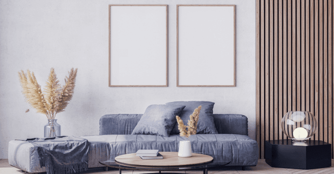
4. Bluish-grey
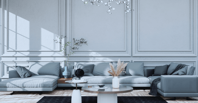
Source : Canva
Bluish-grey is a colder shade that inspires a soothing freshness. Framed by white mouldings or paired with a white ceiling, it will create a warm and welcoming room.
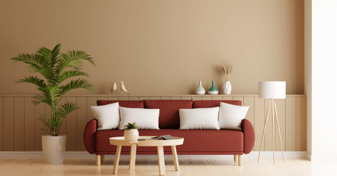
5. Copper
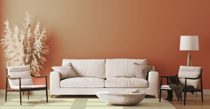
Source : Canva
For people looking for warmer tones, the range of choices in the orange tints could be a perfect solution for you. Just like terracotta, rust is a vibrant colour with earthy tones and an excellent shade for your living room layout.
6. Purple or cashmere grey
Source : Canva
These variants of purple and grey are softer and more neutral compared to their originals. Similar to taupe, these choices are perfect for a calm and serene atmosphere. You'll be able to pair them with other neutral tones to add depth to the room.
7. Dark yellow
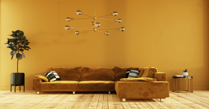
Source : Canva
When thinking of yellow, we rarely associate this shade with the perfect wall colour. However, a darker shade of yellow, like mustard, brings an original and bold accent to the room.
In many examples, this colour is used to define different shapes painted on walls like circles and squares.
8. Hazel
Source : Canva
For avid lovers of fall, hazel brown is a classic colour that ages well. Warm and welcoming, it will be perfect for those nights between friends while enjoying a warm drink.
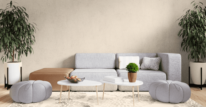
9. Oat/sandy beige
Source : Canva
Just like hazel, sand and oat are shades that age well. Slowly growing in the interior decor trends, shades of beige go perfectly with modern or vintage accessories.
10. Dark grey and black
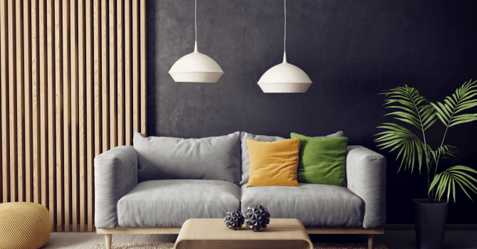
Source : Canva
For people with large windows, these colours will surely complement your room. With white furniture or accessories, you will create a punching contrast that will give life to your living space.
Get 3 renovation quotes for your painting project
RenoQuotes.com can help you get quotes for your house painting project. If you submit your project, we’ll put you in contact with top-rated contractors. Fill in the form on the homepage (it only takes a few minutes) and get estimates from trusted professionals.
Dial 1-844 828-1588 to speak with one of our customer service representatives
Looking for something else?
Related articles
The latest industry news, interviews, technologies, and resources.
Karine Dutemple
•08 Nov 2023
Who said a ceiling has to be dull and boring? If yours lacks style and borders a little too close on the tedious, here are some design ideas that might interest you!
Editorial Team
•28 Jan 2026
What does 2026 have in store for adult bedroom interior design trends? We’ve gathered insights from interior design experts, and it’s clear that there’s something for every taste! From retro wallpaper to biophilic design, along with drapery and soft lighting, you’re sure to find inspiration for your next dream bedroom.

Editorial Team
•10 May 2024
A fixed terrace awning can transform the outdoor space of your home into a true haven of peace by shielding you from prying eyes. This guide will help you better understand the various types of awnings, as well as their advantages and disadvantages. Whether retractable, permanent, or suitable for all four seasons, an awning can be a valuable addition to your home, especially in Quebec where seasons can be extreme. Ready for an outdoor transformation? Read on!

Editorial Team
•16 Sep 2024
Are you hoping to build a bigenerational home to take care of your elderly parents? Albeit it’s only logical to believe that one will be able to benefit from this cohabitating situation, it’s, nonetheless, a rather large-scale project.

Editorial Team
•26 Aug 2025
It’s not much of a secret that the construction industry is facing a labour shortage, as many companies report a lack of labour although faced with growing demands. With the industry itself booming in sectors such as residential housing, commercial properties, and public work projects, the workforce necessary to take on these projects isn’t readily available. So, what effect will the labour shortage have?